Honest & Rare Innovation Challenge
Redesigning the discovery experience for hidden heroes in drinks & food — for Honest & Rare
Designer & Product Lead · Figma / Claude
Honest & Rare is a German premium drinks and food platform built around a single belief: showcasing hidden heroes, independent producers whose stories won't turn up in the mainstream market. Their Innovation Challenge asked for a digital experience that felt as considered and editorial as the products it curates, across two user journeys: a new customer who needs to feel like they discovered something rather than were sold to, and a returning customer who wants relevance and efficiency alongside continued discovery. Four flows were designed, with working prototypes built for Mobile New Customer and Desktop Returning Customer, the combination that gave the widest coverage across both platforms and user states.
I wrote a rationale document alongside the flows themselves, because the brief mattered less than being able to trace every layout decision back to a user need, a brand principle, or a conversion insight. That discipline is what the rest of this case study is built from.
Story and spec, not spec sheets
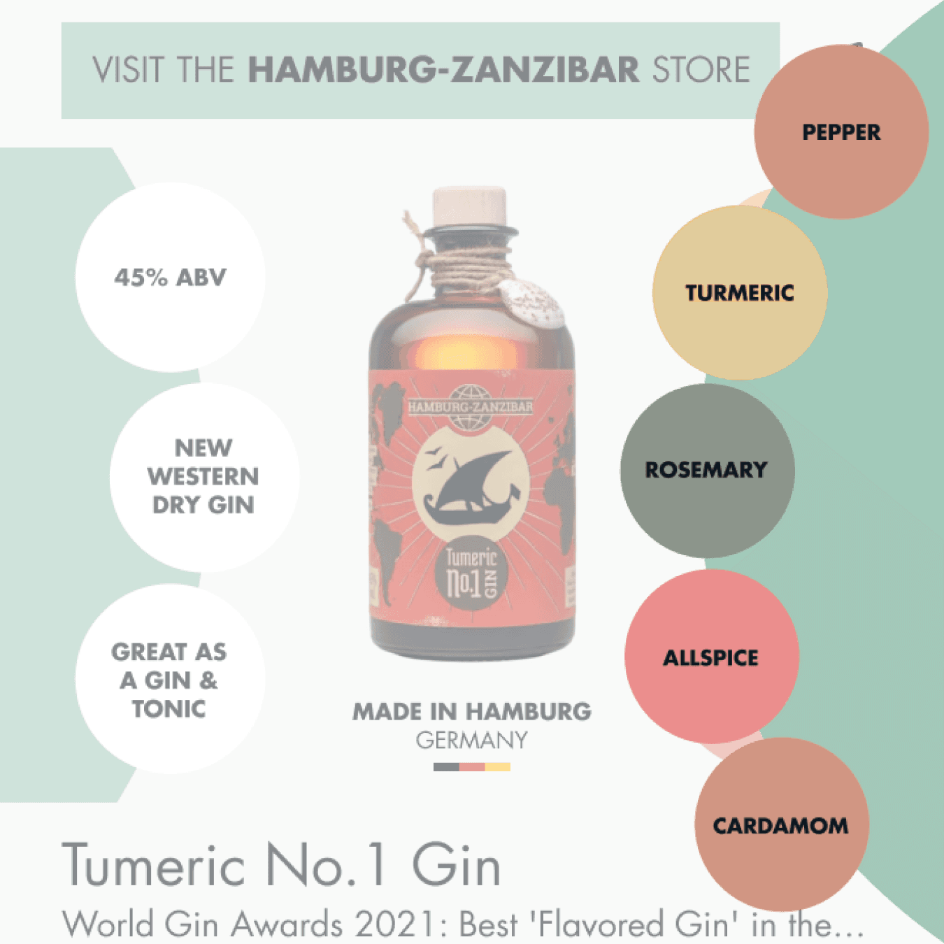
Every product frame shows the specification and the product together, so it reads as one glanceable story rather than a page the user has to assemble themselves. Honest & Rare's positioning is explicitly producer-led: it differentiates on provenance and character, not price or range. A product page that leads with a text-only spec list is indistinguishable from any other retailer, so the producer-store link sits at the top of the frame, not buried below the fold.
The taste profile wheel
Flavour characteristics are communicated through a radial wheel instead of a tasting-notes list. A wheel is glanceable in a way a list isn't: the user reads it without opening a new page, compares two products at speed, and understands which suits their preference without scrolling. It's also a deliberate brand asset. A distinctive visual component does double duty as differentiation at a glance, not just as a UX pattern.
Navigation width, backed by behaviour
Top-level navigation splits broadly: Drink, Food, Gifts, New & Seasonal, Magazine, with subcategories handling specificity underneath. That split isn't a guess. Analytics showed over nine thousand users engaged in product-list browsing, which meant the door needed to stay open for exploration before the interface asked anyone to commit to a subcategory. Occasion-based entry points, a Mother's Day strip on both mobile and desktop, work the same way: they give seasonal and emotional context before the user has decided whether they're browsing or buying.
Why wishlist gets a bottom-nav slot
Mobile bottom navigation carries four icons: Search, Wishlist, Cart, Profile, laid out as the flow a user actually moves through. Wishlist earns a primary slot specifically because saving is both a personal habit and a gifting behaviour for this audience. Making it one tap from anywhere lets someone build a collection, Pinterest-style, without being pressured into a cart and a purchase decision they're not ready to make yet.
The mobile homepage's three jobs
The homepage is structured as three modules, each solving a different intent. An editorial hero answers "what is Honest & Rare?" with a single specific story rather than a generic banner, because that first impression is emotional before it's functional. A discovery engine sits early, while the user is still open to being redirected from browsing everything toward finding the right thing, since further down the page they're too committed to accept that framing. A new-and-seasonal strip closes it out for the self-directed shopper who already knows the platform updates regularly.
Recognised users get a different homepage, not a decorated one
For a logged-in returning user, the "hidden heroes" explanation block disappears entirely rather than staying as decoration. It's replaced by a homepage built around three questions: what have I been looking at, what's new since I was last here, and what would I never have found myself. That third module is the one doing the real work — without it, personalisation collapses into an echo chamber of past purchases, which runs against the brand's whole discovery premise.
Card view over grid, on purpose
Desktop category pages default to a card layout instead of a dense grid. A grid gets the user to a product page fast, but on a first mismatch, fast is a way of deciding the platform isn't for them. Cards keep more information visible per item, so browsing itself does more of the persuading before a single product page has to carry that weight alone.
Consistency across platforms, down to the editorial layer
The taste profile wheel uses the same data model and visual language on mobile and desktop, so a pattern learned on one platform transfers instantly to the other, colour-coded consistently for quick recognition. The magazine template got the same discipline: an alternating grid of image and copy instead of a wall of text, with an optional, dismissible product list tied to the article, which doubles as a signal for which editorial content a reader actually wants to see products against.
Photography treatment and reference points
Every editorial image communicates one specific message about the product or producer, in service of the brand's honesty pillar, rather than existing as generic lifestyle filler. None of the reference points behind these decisions were direct competitors: Vivino's radial approach to flavour visualisation, Headspace's occasion-first entry over a catalogue-first one, and Airbnb's returning-user homepage, which treats recognition as a functional feature rather than a cosmetic one.
AI tools were used at specific points in research, planning, and analysis, not generation: Claude for structuring the submission and auditing competitor documents, ChatGPT for testing how Honest & Rare and its competitors surface in AI-generated search responses, and Gemini for behavioural analysis in Google Analytics. Submitted with a team of five as part of the Honest & Rare Innovation Challenge.